

 HANDS ON SharePoint
 HANDS ON Teams
 HANDS ON Lists
 HANDS ON tek
 M365 Admin
Microsoft Teams is about to change – Meet the new design
Just a few days after Teams has reached 115 million users, we get the chance to see for the first time the new design that will soon land in all tenants worldwide.
Microsoft is updating the Default and Dark themes, changing the background colors and icons to align with the Fluent design already available in other Microsoft 365 applications.

What changes in the new Microsoft Teams design?
Microsoft uses the Fluent design system to ensure a cohesive and accessible design for all Microsoft products and users. Most changes are subtle, such as:
- Added drop shadows between panels
- Rounded corners for square graphical elements (like buttons)
- Color adjustments to the default and dark themes
- Personal app bar color change
- New Fluent icons
For comparison below you have the new and old designs of Microsoft Teams.
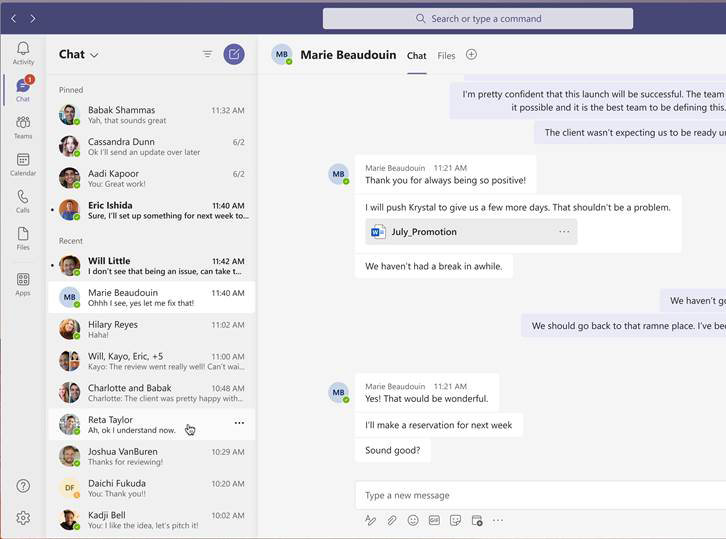
New Microsoft Teams
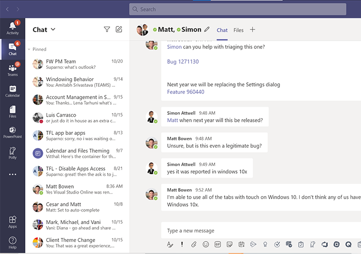
Old Microsoft Teams
When is the new design available?
The redesign of the Microsoft Teams client is listed in the Roadmap item 68721 and is expected to be released worldwide before the end of 2020, becoming available in GCC tenants in the beginning of 2021.
- Targeted release: mid-November
- Standard release: early December
- Government cloud: mid-January
You may want to notify your users about this change to avoid get them caught by surprise.


March 5, 2021
It changed this week for our company and it’s awful. Complete lack of overview with the side panes being the same color. Everyone is annoyed by it.
And those rounded icons.. Does the Microsoft design team consist out of 12 year olds who love comic sans or something? It looks childish.
March 9, 2021
The new update sucks. The old one looks so much better.